What if AI could evaluate UX design as effectively as a senior UX designer?
I'm building the bridge between artificial and human design intelligence - a tool that doesn't just assess UX, but revolutionizes how we think about design evaluation.
PROGRESS SO FAR:
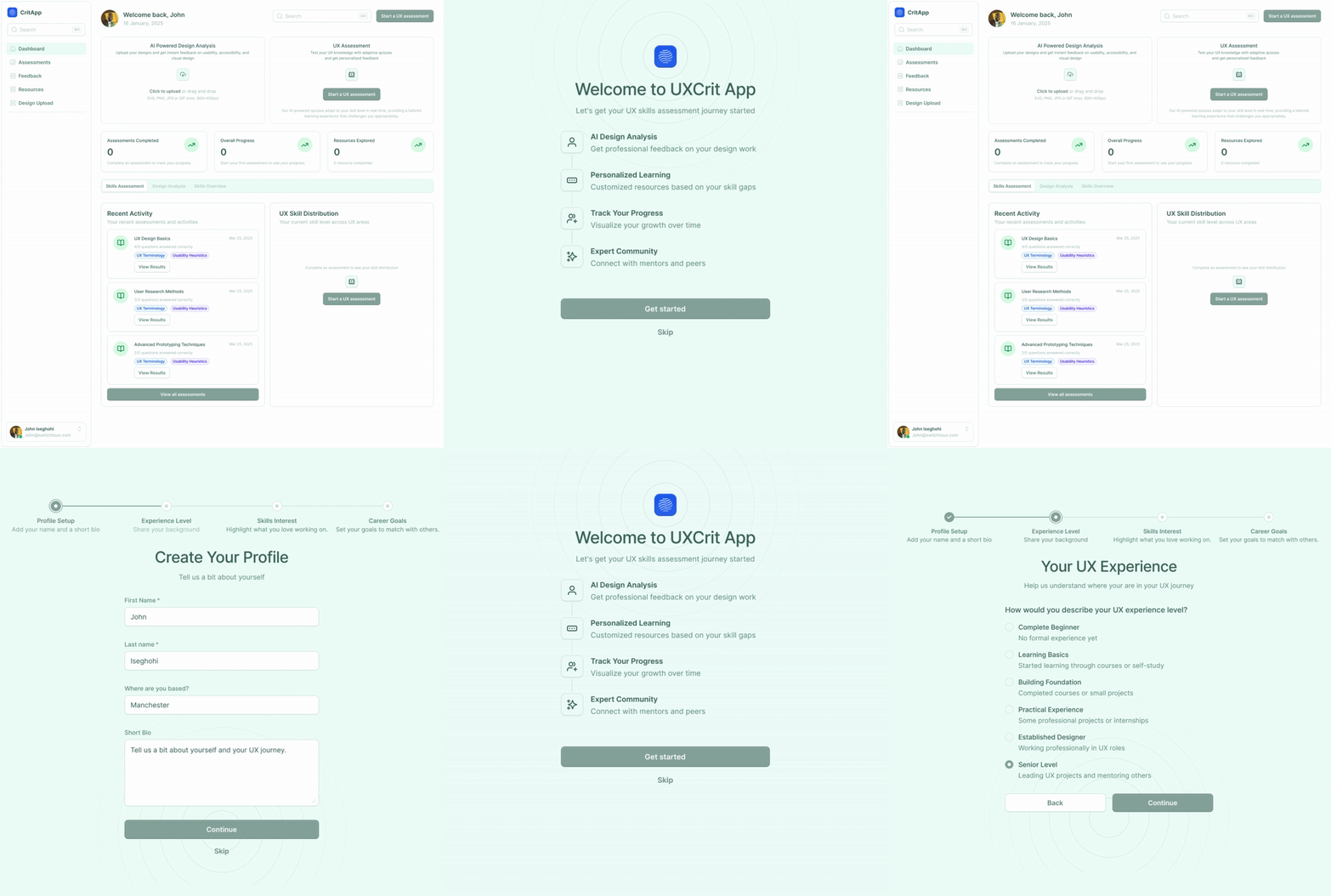
I've completed the initial wireframes for the main assessment flow and defined the visual design system.
For the UI, I'm using a clean and professional mint green color palette that creates a calm, focused environment for assessment work.
The goal is to make the assessment process both professional and approachable.
BEHIND THE SCENES:
Here's something I haven't shared publicly: I tested five different color palettes with designer friends before settling on this direction.
The results were surprising—designers consistently rated the vibrant mint green palette as more "trustworthy" and "professional" compared to muted options, challenging typical assumptions about enterprise software design.

DESIGN DEEP DIVE: CORE UX PRINCIPLES
The UX Skills Assessment tool will evaluate designs based on five fundamental principles:
Visual Hierarchy
Rationale: How elements are visually prioritized directly impacts user understanding
Evaluation approach: The AI will analyze size relationships, color contrast, positioning, and whitespace to determine if the visual hierarchy aligns with the information hierarchy
Common mistakes: Equal visual weight for all elements, competing focal points, buried primary actions
Accessibility
Rationale: Good design works for everyone, regardless of abilities
Evaluation approach: The tool will check color contrast ratios, text sizes, alt text presence, keyboard navigability, and other WCAG guidelines
Common mistakes: Insufficient contrast, relying solely on color to convey information, inaccessible interactive elements
Consistency
Rationale: Consistent interfaces reduce cognitive load and build user confidence
Evaluation approach: The AI will identify pattern adherence across components, spacing, typography, and interactions
Common mistakes: Inconsistent button styles, varying terminology for the same concept, unpredictable interaction patterns
Information Architecture
Rationale: How information is organized determines how easily users can find what they need
Evaluation approach: The tool will analyze content grouping, labeling clarity, navigation patterns, and information flow
Common mistakes: Illogical groupings, confusing navigation, buried important information
Usability
Rationale: The ultimate measure of design effectiveness is how easily users can accomplish their goals
Evaluation approach: The AI will evaluate against Nielsen's heuristics, analyzing system feedback, error prevention, user control, and recognition vs. recall
Common mistakes: Hidden system status, confusing error messages, lack of user control
The most interesting challenge in designing this tool is creating an interface that exemplifies these principles while evaluating them in others' work.
It's meta-design at its finest!
I'm curious: Which of these five principles do you find hardest to evaluate objectively in your own or others' designs?
Reply directly to this email—I love hearing your perspectives!
Coming tomorrow: I'll share how I'm implementing the technical architecture to support AI-powered design analysis.
Let’s go!
John
P.S. If you know someone who would find this email helpful, please forward it to them so they can subscribe to my newsletter. Click here to subscribe